
Examining a recent Atlantic storm offers some insight

Ocean-going mariners have many sources for weather forecast information these days, and thanks to the internet and satellite communication technologies, these resources are readily available both ashore and at sea. Improvements in the science of weather forecasting have allowed longer and longer-range forecasts to be produced in recent years to the point that 96- and 120-hour (four- and five-day) forecasts are now routinely available, and even longer range forecast information can be accessed. But it is worth asking the question: How reliable are these forecasts?
To answer this question, let’s look at a recent situation.
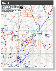
The northeastern U.S. and Atlantic Canada were hit with a powerful nor’easter in late January of 2022. This system produced large amounts of snow and also generated very strong winds both over land areas and over the ocean. Figure 1 is the surface pressure analysis chart which shows this system on the morning of January 29, 2022. The strong winds from this system resulted in very high seas over coastal and offshore waters with significant wave heights up to 26 feet east of New Jersey at 1200 UTC January 29, and up to 35 feet east of southern New England 12 hours later at 0000 UTC January 30.
This system was generally very well forecast. Media reports for many days prior to the arrival of the system were highlighting the possibility of a major storm, and weather forecasts, both the official government forecasts, and those produced by the media, were quite accurate in describing the impacts of the storm. Often the hype in advance of significant weather events can be over the top, but in this case it was generally justified. This does not mean that all forecast parameters were perfect for all locations — that is a standard that is rarely met — but the forecasts available to the public provided a very good picture of conditions produced by this system well in advance.
This is rather remarkable given the fact that an identifiable low-pressure center at the surface was not present for this system 24 hours before the time of Figure 1. Forecasters of a couple of generations ago likely would have had the ability to predict the development of this storm based on upper-level weather patterns a couple of days in advance. It would have been difficult, however, to predict the intensity of the system, and an accurate forecast for such a system more than about three days in advance would most likely not have been possible.
Long-range forecasts
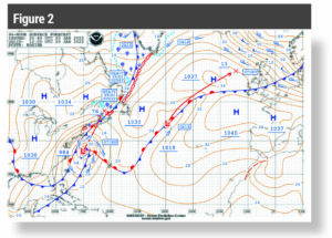
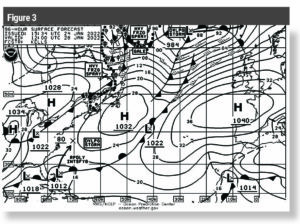
Figure 2 shows the 96-hour surface forecast chart valid at the same time as Figure 1. This chart, which was generated four days before the system was impacting the northeastern U.S. and the adjacent Atlantic, forecast that the low would be located a bit farther south than where it ended up, and that its central pressure would not be quite as low. Figure 3 shows the 96-hour forecast that was produced 24 hours earlier than Figure 2. There is no significant low forecast to be present in the eastern U.S. or over the adjacent Atlantic at the valid time of this chart, but the arrow in the western Atlantic does indicate a low forecast to develop after the valid time of the chart, showing a forecast center position 24 hours after the valid time of the chart (the same time as Figures 1 and 2) at about 37° N/70° W and a forecast central pressure of 980 millibars. The term “rapidly intensifying” on the chart indicates that the central pressure of a low is forecast to drop at least 24 millibars in a 24-hour period, the criteria for a “bomb cyclone.”
While neither of these 96-hour forecasts were perfect, they were both remarkably good for a system like this, providing five days of notice that there would be an impactful storm affecting this region. Thus, for this system, the long-range forecasts were extremely accurate and very useful.
Let’s dig a little deeper as to the origin of this system. Mid-latitude lows like this one are powered by energy in the upper levels of the atmosphere which is often best represented by looking at waves in the 500-millibar flow. Much like waves on the surface of the ocean, waves in the atmosphere can grow, or amplify with time, but can also flatten out, or weaken with time. Also, like ocean waves, there are bigger waves and smaller waves, and they all interact with one another, sometimes combining to produce a really big wave, and at other times interacting in a way that leads to waves becoming less prominent with time.
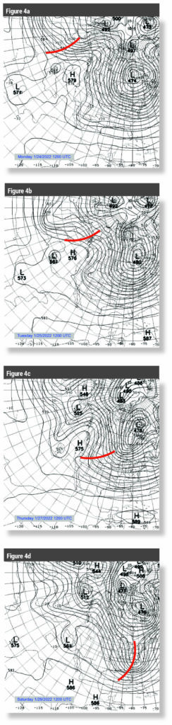
Figure 4 shows 500 millibar analyses across a good portion of the northern hemisphere for selected days in the week leading up to the nor’easter. Examining the final panel of Figure 4, which is the 500 mb analysis valid at the same time as Figure 1 when the nor’-easter was well developed as a powerful storm in the western Atlantic, one can plainly see a well-developed, high amplitude wave in the 500-millibar flow over the eastern U.S. This is termed an upper level trough, and the red line shows the rough axis of the trough. Strong surface lows are typically found downstream of 500-millibar trough axes during their developing phase, and this was certainly the case in this situation. Then, by working backwards in time, one can see where this trough axis was located in the days leading up to January 29, 2022.
The first panel in Figure 4 was valid on Monday January 24, 2022, and this is the actual data from which the 96-hour forecast shown in Figure 3 was generated. It is remarkable that forecasting skill has evolved to the point that a somewhat nondescript 500-millibar trough that extended from the upper Aleutian Islands south toward Hawaii was able to be forecast to develop into a very strong mid latitude low in the western Atlantic five days later with such precision.
The second panel in Figure 4 was valid the next day (Tuesday January 25, 2022). This is the actual data from which the 96-hour forecast, shown in Figure 2, was generated. Again, this trough, then located
to have higher confidence in the prediction. The third panel of Figure 4 (valid two days after the second panel) shows that the 500-millibar trough has progressed up and over the upper level ridge over the western U.S. and has begun to amplify as it nears the central U.S., and it is well on its way to supporting the development of the strong nor’easter.
The example of this nor’easter is clearly a situation where the long-range forecast was very good, perhaps even excellent. Even though every forecast is not as accurate as this one, studies generally show that forecasting skill has improved significantly over the past few decades. Much of this improvement can be linked to the advances in the computer models to the point that forecasts of conditions four to five days ahead are quite reliable, as in this case. At times, though, situations can exist where forecasts of this range are not as successful. This can be traced to several possible issues, including poor initial data, particularly over data-sparse areas of the planet (like open ocean areas), wave patterns that are unstable or cannot be well resolved in the initial data, and shortcomings in the forecast models.
Ensemble forecasts
Another tool which has come into more common use in recent years is the ensemble forecasting method. This involves acknowledging that the initial data may not be completely accurate and running a model multiple times with very slight changes in the initial data field. The idea behind the concept is that if the pattern is generally more predictable, then the slight changes in the initial data field will not make much difference, and the model will tend to converge on the same forecast output at a given future time. On the other hand, if the pattern includes elements that are less able to be accurately forecast (perhaps small-scale features that cannot be well defined are present, or the model may have difficulty capturing how the different scales of waves will interact with one another) then the small changes made in the initial conditions will lead to very different outputs as time is stepped forward in the model. This allows the forecaster to be more (or less) confident in the results of each model run.
The general public is used to seeing deterministic forecast products, which in the case of forecast charts means that the forecaster must state that, for example, a low-pressure center will be in a certain position at a given future time, and that it will have a specific central pressure value. The 96-hour forecasts shown in Figures 2 and 3 are examples of deterministic forecast products. But the reality of meteorology is that forecasting is often more probabilistic in nature, with multiple outcomes possible given an initial pattern and our current knowledge of the atmosphere. The ensemble technique is able to help assess the probability of possible different future outcomes of certain weather fields, like the 500-millibar pattern or the surface pressure pattern. The forecasters at the NOAA’s Ocean Prediction Center have access to the ensemble forecast fields, and this can help them to come up with the most reasonable deterministic forecast at a given time.
surface
forecast for March 7, 2022.
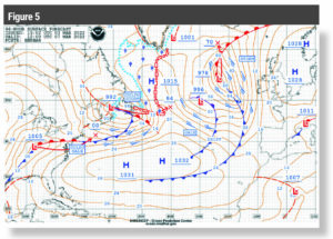
Figure 5 shows a 96-hour surface forecast valid at 1200 UTC on March 7, 2022. Figure 6 is an example of ensemble forecast output from the same forecast cycle, valid at the same time. There are 30 ensemble “members”, which represent 30 different tweaks to the observed data set that initialized this model run. In this depiction, only one isobar is shown (996 millibars), but it is shown for every ensemble member. These charts are sometimes referred to as “spaghetti plots.” Notice that the collection of isobars (ensemble members) around Newfoundland and Atlantic Canada shows some variation, but not a lot. This allows the forecaster preparing the chart in Figure 5 to be fairly confident in the placement of a low in that region. Looking farther east, though, there is quite a bit more variation in the ensemble members of the isobars, suggesting more computational instability in the pressure fields generated by the model for this region, and this means that the placement of the low on the forecast chart has a lower probability of being correct when the actual time arrives. There is no indication of this lower probability on the deterministic forecast chart, though, as the forecaster must make the best decision possible for the forecast location and strength of this low in the eastern Atlantic.
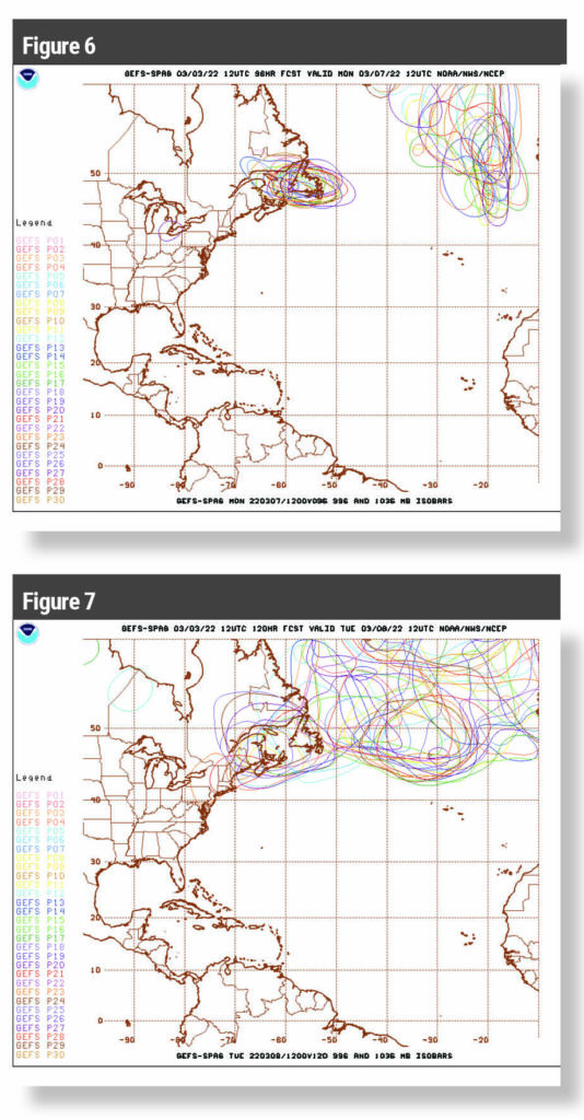
Figure 7 is the ensemble model data from the same model run and for the same isobaric value, but it is valid 24 hours later. This clearly shows that this data set becomes more computationally unstable for the later forecast time. This means that the arrows showing the movement and forecast central pressures of the lows on the 96-hour forecast chart (Figure 5) have a lower probability of ultimately being correct.
Weather apps and forecasts
There are many weather apps available to mariners that provide forecasts of several different parameters, and these apps generally present output from forecast models without any input from human forecasters. The models that are used most frequently are the US-based GFS model, and the European-based ECMWF model. Questions are often asked as to which model is better, but there is no one set answer to this as the models will perform differently in different weather patterns, and sometimes one will provide a better forecast, and sometimes the other will be superior. Sometimes these two models will show significantly different forecasts, particularly in the longer-range time periods. When this occurs, it is an indication that the existing weather pattern does not lend itself well to being predicted by the mathematical models. When these two models show similar forecasts, the confidence level in their forecasts is increased.
The answer to the question initially posed is that forecasts in the four- and five-day range are generally quite good and can be used reliably to make decisions about ocean voyages. But they are not perfect, and forecast data generally becomes less reliable for longer ranges. As noted above, some weather patterns are more predictable than others, and the ensemble forecast data offers a window into this situation. This data can be found through NOAA’s Model Analyses and Guidance web page (mag.ncep.noaa.gov). Those mariners who have access to data from different models through apps (often termed GRIB data) should interpret differences in the model output as an indication of a lower probability forecast, and should consider that all possible outcomes are possible, and plans should be made with that in mind.
Another strategy that should be employed by mariners is to pay attention to how the model (GRIB) data changes in successive model runs. Again, if there is consistency from run to run, this generally suggests a higher confidence level in the forecast output.
Keep in mind that weather apps providing GRIB model output are just tools, and it is always best to use them in combination with forecasts produced by professional meteorologists. This includes forecasts available through NOAA’s Ocean Prediction Center.
The meteorologists who generate these forecasts have access to everything that a mariner may see in an app, and obviously much more as well. These additional resources including model data from several models, ensemble plots, and they may also have information about any shortcomings in the initial data set for each forecast cycle.
Professional meteorologists use this data along with their knowledge and experience to produce with the best deterministic forecasts possible. The end result is steadily improving long-range forecasts.
Ocean Navigator contributing editor Ken McKinley is a weather professional and vessel router who owns Locus Weather (www.locusweather.com) in Camden, Maine.