Many mariners are familiar with the surface weather charts from NOAA’s Ocean Prediction Center (OPC) and make regular use of these charts to help make their weather-related voyaging decisions. There has been a small, but important change in the information presented in these charts that was implemented rather quietly late last year. The OPC is now accepting comments on this change, which offers mariners a key opportunity to have a say in the type of information that they receive.
The change involves the placement of arrows on the surface charts indicating the forecast movement of highs and lows. Previously, the arrows indicated this movement in 24-hour increments centered on the valid time of the chart. The central pressures of the highs and lows were also shown on the chart not only at the valid time of the chart, but also for the forecast positions both 24 hours prior to the valid time of the chart and 24 hours subsequent to the valid time of the chart.
 |
|
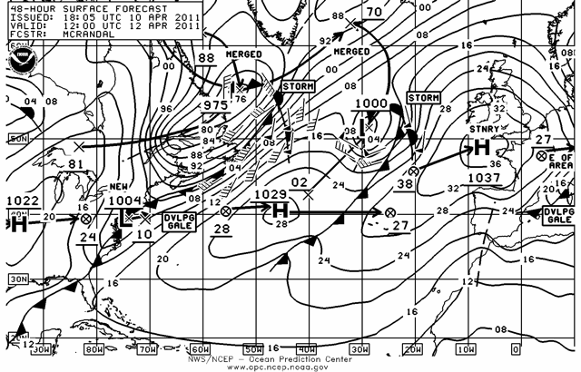
48-hour forecast chart. Courtesy Ocean Prediction Center |
As an example, the 48-hour forecast chart, valid at 1200 UTC on April 11, 2011, shows a low in the north central Atlantic centered near 51N/29W with a forecast central pressure of 1000 millibars. Also shown (with an “X” marking the spot) is the forecast position of the low 24 hours prior to the valid time of the chart (1200 UTC April 10, 2011) near 43N/40W and its expected central pressure at that time of 1002 millibars. An arrow extends from this point to the April 11 forecast position, and similarly, an arrow extends from the April 11 position forward to the expected position 24 hours subsequent to the valid time of the chart (1200 UTC April 12, 2011) near 62N/32W, marked with an “X” and also with the expected central pressure at that time of 970 millibars.
This method permitted the user of the chart to easily see 48 hours of forecast movement of high and low centers on one chart, and together with the forecast central pressure of the highs and lows, to observe the strengthening (or weakening) trends of the pressure centers through the same 48-hour period. By combining an analysis chart (actual data) with the 48-hour and 96-hour forecast charts from a given forecast cycle, a mariner could track the forecast motion and intensities of highs and lows through a five day period.
With the recent change, however, the positions of highs and lows 24 hours prior to the valid times of the charts and the arrows connecting them to the highs and lows shown on the charts have been eliminated. The OPC believes that this will make the charts more readable. While it is true that sometimes the charts can become rather “busy” in more complex weather situations, I believe that there are other ways that the clutter can be reduced on the charts without removing half of the tracking information for the high and low centers. The number of wind barbs could be reduced, particularly in areas where the wind speed and direction is quite similar. The orientation and spacing of the isobars gives the mariner a general indication of wind speed and direction. Perhaps the type face showing the central pressure of highs and lows could be made a bit smaller, and when there are a lot of isobars present, some of the labels could be eliminated in more congested areas of the charts. These changes would not materially reduce the information presented on the charts, but the elimination of the arrows showing the previous positions of highs and lows, and their intensity information, does remove what, at times, could be a key piece of information.
In terms of the 48-hour chart referenced above, the arrow pointing from the 43N/40W position toward the low on the chart would not be present if that chart were produced today, and the central pressure at that position would also be eliminated. Also, the high which is shown moving east along about 40N in the central Atlantic would have only one arrow extending forward from its position on the chart, and the arrow pointing toward the high from its forecast position 24 hours prior to the valid time of the chart would be eliminated. Similarly, the arrow extending from just east of Lake Superior to the strong low in the Labrador Sea would not be present.
 |
|
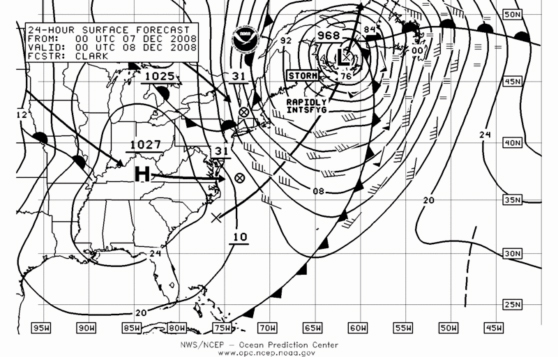
24-hour forecast chart. Courtesy Ocean Prediction Center |
As another example, on the 24-hour forecast chart valid at 0000 UTC Dec. 8, 2008, the arrow indicating the motion of the low moving northeast off the East Coast of the U.S. toward Nova Scotia would be eliminated which would prevent users of this chart from knowing how this system was forecast to track during the 24-hour period between 0000 UTC Dec. 7 and 0000 UTC Dec. 8. Given that this system was forecast to rapidly intensify through this period, and that its track moved through a rather critical area for many mariners, the loss of this information on this chart is quite significant.
It is certainly true that the information regarding the forecast positions of lows and highs through the forecast cycles can be found on other charts. In the case of the 48-hour chart referenced above, the positions and intensities of highs and lows 24 hours prior to the valid time of the chart can be found on the 24-hour forecast chart from the same forecast cycle in the western Atlantic (this is only a regional chart) and can also be found on the analysis charts for the forecast cycle across the entire Atlantic by looking at the arrows pointing ahead 24 hours from the highs and lows on that chart. It is also true that a mariner should take the time to examine the complete set of charts from each forecast cycle, and it could be argued that all of the information is still present when looking at all of the charts together. However, sometimes not all the charts are available, and the continuity of the motion of the systems can be better seen if both 24-hour positions and arrows are shown on the same chart, as was the case until late last year.
The good news regarding this situation is that mariners have a chance to voice their opinions on the change. To do so, simply go to the Ocean Prediction Center website (www.opc.ncep.noaa.gov) and click on the link at the top of the page where feedback is requested for historical positions on charts. Here is a direct link to the correct page: http://www.opc.ncep.noaa.gov/feedback_tracks.shtml.
The examples that are provided on this page are rather busy charts with relatively slow moving systems, which could make the change seem a bit less important. It is worth considering what the charts shown in this newsletter would look like without the previous 24-hour positions and the respective arrows indicating their motion during that 24-hour period.
Whatever your opinion is on this issue, make your voice heard! This is your chance to influence the type of weather information that your government will provide to you.

