For this newsletter, I thought it might be a good idea to look at a few surface forecast charts and go through the features of the charts. This has been done before, but it is always good to have a refresher for this material, and there have been a few changes in the charts in recent years. Then I realized that we have just passed the summer solstice in the northern hemisphere, so it made sense to look at some charts produced on the summer solstice, and also to look back at the same charts produced on the winter solstice in December of 2021.
We will look at 48-hour surface forecast charts for both the Atlantic and the Pacific for both solstices. These charts show expected conditions at a future time and include centers of high and low pressure, isobars, fronts, surface troughs, marine warnings, some wind barbs, and forecast movements of some low-pressure centers.
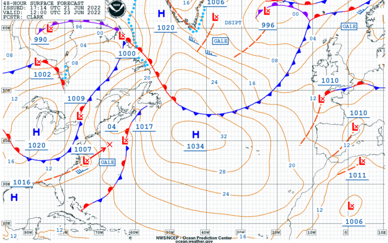
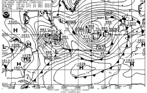
Using Figure 1, the summer solstice 48-hour surface forecast for the Atlantic, let’s go through the features of the chart. Isobars are lines drawn on the chart where surface pressures are the same. On this chart, the lines are brown, and are labeled with two-digit numbers which represent the final two digits of the surface pressure in millibars. The average surface pressure is a little more than 1,013 millibars, so when the two-digit number is smaller, usually the pressure will be 1,0xx millibars, and when the two-digit numbers is larger, the pressure will be 9xx millibars. There can be exceptions to this, but these occur only when the pressure is unusually high or low, and this will generally be obvious when looking at a chart that depicts a very strong high or low pressure center. On this chart, the only isobars below 1,000 millibars show up over Hudson Bay in Canada. Isobars on most U.S. charts are drawn at four-millibar intervals and always include the 1,000-millibar isobar.
Also shown on the chart are high and low pressure centers, labeled with their central pressure which is underlined. Highs are blue, lows are red. The forecast movement of lows for 24 hours following the valid time of the chart is shown only when the lows are forecast to produce at least gale-force winds either at the valid time of the chart or within 24 hours of that time. The forecast central pressure of the low at its future position is shown as a two-digit underlined number. For example, in Figure 1, the low shown east of Cape Hatteras is forecast to have a central pressure of 1,007 millibars at the valid time of the chart. It is forecast to move northeast and be located at a position of about 39 N/67 W (marked “X” on the chart) 24 hours after the valid time of the chart (at 12 UTC 24 June 2022) with a central pressure of 1,004 millibars. Thus, the user is able to determine that this low is forecast to strengthen a little during the 24-hour period. The only other low that is forecast to produce gale-force winds at the time of the chart is just east of southern Greenland, and there is no arrow and forecast position with this low because it is forecast to dissipate within 24 hours of the valid time of the chart (indicated by the abbreviation “DSIPT”). The forecast movement of highs is not shown on the chart.
Regarding warnings, there are three types of warnings shown on the charts: A Gale Warning indicates expected sustained surface winds, or frequent gusts, in the range of 34 to 47 knots; a Storm Warning indicates expected sustained surface winds, or frequent gusts, in the range of 48 to 63 knots; and a Hurricane Force Warning indicates expected sustained surface winds, or frequent gusts, of 64 knots or more. Note that a hurricane force warning is not associated with a hurricane, rather a very strong non-tropical low.
Four types of fronts are shown on the chart: Cold fronts are shown as blue lines with triangles along the line pointing in the direction of movement of the front; warm fronts are shown as red lines with semi-circles along the line pointing in the direction of movement of the front; occluded fronts are shown as purple lines with alternating triangles and semicircles, and stationary fronts are shown as segments of red and blue lines with triangles along the blue segments and semi-circles along the red segments on opposite sides of the front. Typically cold fronts are associated with showery precipitation including thunderstorms and squalls, and warm fronts have larger areas of steady precipitation ahead of them, sometimes with some embedded thunderstorms. A more detailed description of frontal characteristics will have to wait for another time.
Surface troughs are shown on the chart as dashed brown lines. These features are similar to fronts except that they do not indicate a change in air mass (colder or warmer) as they pass, but they do feature wind shifts and sometimes some occasional precipitation.
The light blue dotted line along the coasts of Labrador and Greenland indicates the edge of sea ice areas. This does not indicate the location of icebergs, however, as icebergs are transported by currents well beyond the sea ice regions. It is necessary to consult the North American Ice Service to determine the location and extent of Icebergs in the Atlantic.
Wind barbs showing the expected direction and speed of the wind in the usual manner are shown on the chart, but only where sustained winds of at least 35 knots are expected. On this chart there are only four such wind barbs shown. Sometimes in the summer forecast charts may not have any wind barbs on them at all.
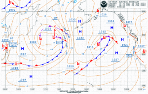
Moving to Figure 2, the summer solstice 48-hour chart for the Pacific, the features of the chart as described in Figure 1 are the same. Note on the far western end of the chart there is low forecast to move onto the chart and end up near northern Japan with a forecast central pressure of 987 millibars. In this case, the abbreviation “DVLPG” precedes the Gale Warning with this low, and this indicates that while gale conditions are not expected at the valid time of the chart, they are expected within 24 hours after the valid time of the chart. Also of note, the Gale Warning off the coast of California is not associated with a low center, but rather with the trough of low pressure which lies just inland of the west coast of the U.S. This is a common summertime pattern in this region with the trough resulting from the contrast of very hot conditions of the interior western U.S. and the much cooler conditions over the coastal waters. This shows that it is the pressure difference with distance which generates wind, not the absolute pressure values. In this region the isobars are close together which shows a strong pressure difference over a short distance.
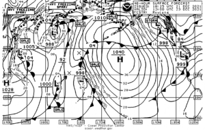
Figure 3 is the winter solstice 48-hour chart for the Atlantic. Apart from not being in color, the features of this chart are the same as the summer charts. Archived charts are provided in black and white, and charts received through weatherfax will also be delivered in black and white. The resolution of these charts is a bit less than the color ones, and this often results in not so many isobars being labelled. Just keep in mind the four-millibar spacing, and it is possible to determine the value of any isobar by referring to the ones that are labeled. Other than the difference between black and white and color, the biggest difference between this chart and the summer chart is that it is a lot busier. Much stronger systems are often present in the winter, so there are a lot more isobars, and many more wind barbs. This chart also features several Storm Warning areas in addition to Gale Warnings. Also of note, just north of the Azores there is an “X” indicating the location of a low center 24 hours after the valid time of the chart with a forecast central pressure of 995 millibars. The word “NEW” is shown near this position, and this means that this low center is not forecast to be present at the valid time of the chart, but is forecast to develop within 24 hours of the valid time of the chart.
One more item that is shown on wintertime charts, and that is an area where freezing spray is anticipated. This is shown by alternating open dots and dashes, and on this chart such an area is located east of the northern coast of Labrador.
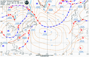
And finally, Figure 4 (below) is the winter solstice 48-hour forecast chart for the Pacific. The only additional features to note on this chart are the symbols for freezing spray near eastern Russia and in the Bering Sea. The cross section of a ship hull with one line through it indicates moderate freezing spray, and with two lines through it indicates heavy freezing spray.
Many mariners make use of commercial products which display model forecasts of winds and sea state in a very pleasing manner, commonly known as GRIB data. While these are very useful tools, the surface forecast charts such as the ones presented in this newsletter provide more insight into the actual weather features which impact ocean passages and are therefore very important to understand and to use.
Contributing editor Ken McKinley is a weather router for both commercial and recreational clients via his company Locus Weather in Camden, Maine.