Columbus Day weekend has now passed in the U.S. at the time of this writing, and there are certainly signs on the weather maps of the North Atlantic and North Pacific of the more active weather patterns characteristic of the colder season beginning to show up. On the other hand, some features that are definitely aligned with warmer season weather are still present. For this newsletter, I am simply going to take a look at the surface weather maps for both oceans at 1200 GMT on Oct. 14, 2014.
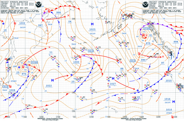
Looking first at the Atlantic (Figure 1), the feature that catches our notice right away is the very large low, located in the eastern Atlantic with its center near 51° N, 32° W. This is a huge system, very much like a mid-winter low. Note the central pressure of 956 millibars and the large number of isobars surrounding the system; this, of course, means that strong winds surround the low. Notice also the Storm Warning designation associated with the low, which means that the surrounding sustained winds fall into the range of 48-63 knots. There is one ship report just north of the low center, reporting 45 knots of wind. Notice also the occluded front extending initially west-southwest from the low, then curling around it until it joins with a warm front and a cold front near 44° N, 16° W. This is called a triple point. The presence of such a long occluded front usually indicates that a system is no longer strengthening and may be weakening, and also that it may be trapped underneath an upper-level low. We can confirm this by examining the arrow extending east-southeast from the low center and indicating that 24 hours after the valid time of the chart, the low will have a central pressure of 964 millibars — not as low as its current reading. The forecast 24-hour position shown by the “X” at the end of the arrow indicates the relatively slow motion.
| Figure 1 |
 |
|
Ken McKinley |
In the central Atlantic, we find another low center with a much smaller circulation near 34° N, 42° W. A couple of days before, this system was Hurricane Fay, which made nearly a direct hit on Bermuda as a strong tropical storm during the wee hours of the morning on Sunday, Oct. 12. The system then moved quickly east-northeast, then east after departing Bermuda, and merged with the frontal boundary extending from the larger low in the eastern Atlantic and lost its tropical characteristics. Even though it is much smaller than the eastern Atlantic low, it also has a Storm Warning designation, meaning it is generating winds of similar strength as the larger system, although over a much smaller area. It is also forecast to weaken, as shown by the arrow and the “X” designating its future position, although it is moving more quickly than the larger low to the north. Much like the seasons, this system has been in transition through the days leading up to this chart.
A definite warm season system is seen farther southwest, and that is Hurricane Gonzalo just to the north of the Virgin Islands. At the time of this chart, this was a strong Category 2 hurricane. The central pressure is shown as 974 millibars, but the isobars surrounding the system are not shown, with only a 1012 isobar showing the circulation. This is typical for these charts because there is simply not room to squeeze in the number of isobars that would be needed on the chart and have them still be legible. Isobars are drawn over 4 millibars, so a simple calculation tells us that nine isobars would be needed inside the 1012 isobar that is shown. At this writing, it appears that Gonzalo will become even stronger in the coming days, and unfortunately its track is likely to be very close to Bermuda, meaning that they will get hit by a second system less than a week after Fay, but this one will be much stronger. Gonzalo is a rather compact hurricane, which is evident by the small size of its circulation on the chart.
Elsewhere on the chart, we find a strong low to the southwest of Lake Michigan, a low looking more like a wintertime system, although temperatures behind its cold front are not yet cold enough to produce widespread wintry precipitation. Rather mild temperatures prevail east of the cold front in the eastern U.S., and we note high pressure over the Atlantic south of Nova Scotia contributing to southerly windflow along the east coast of the U.S.
| Figure 2 |
 |
|
Ken McKinley |
Shifting to the Pacific (Figure 2), we don’t find any systems as large as the eastern Atlantic low, but we notice a rather active weather pattern with lows east of northern Japan in the central Pacific near 47° N, 177° W, and in the eastern Gulf of Alaska, which is more typical of the cold season. The systems in the central and western Pacific are forecast to move rather quickly as shown by the arrows extending from their centers to the “X”s marking their forecast positions 24 hours after the valid time of the chart. The Gulf of Alaska low is moving much more slowly, and we note that it does indeed have a long occluded front, which extends initially to its north, then well to its east.
Continuing the theme of transitions, the strong low in the western Pacific was Typhoon Vongfong, which tracked northeast right along the main Japanese Islands during the days leading up to this chart and caused significant damage along with injuries and fatalities. At the time of the chart, the system is no longer tropical in nature as it has drawn colder air in from the north and developed fronts. However, it is still producing strong winds as indicated by the Storm Warning designation.
| Figure 3 |
 |
|
Ken McKinley |
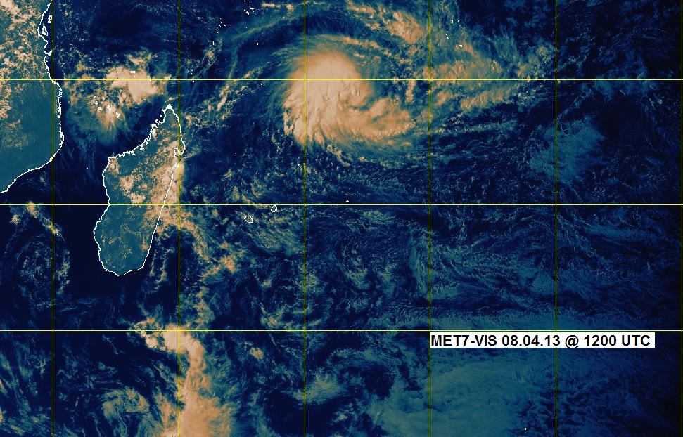
And finally, a true warm season system, which just barely shows up on the southern margin of the chart to the east-southeast of Hawaii. On this chart it is shown only as a curve in the isobars with a lower isobar just west of 140° W, but if we examine a chart of the tropical Pacific (Figure 3), we can see more clearly the presence of Tropical Storm Ana. At this writing, the expectation is that Ana will become a hurricane while tracking toward the west-northwest, and it may pose a threat to the Big Island of Hawaii. This would be the second hurricane this season to directly impact the Big Island after Iselle back in August, which I wrote about in the previous newsletter.
Sometimes it’s just interesting to look at the charts to see what’s going on. Some of the terminology used in this newsletter has been explained in previous newsletters, and it is also possible to visit the Ocean Prediction Center website, where charts like Figures 1 and 2 can be found, and the National Hurricane Center where charts like Figure 3 can be found to find more comprehensive explanations of the charts. Ocean voyaging mariners should be familiar with these charts and what they depict, and the upcoming winter season (in the northern hemisphere) is a great time to refresh one’s knowledge!